
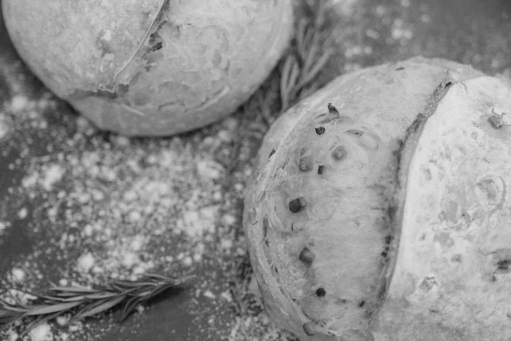
Sifted Bakehouse
Building a handcrafted bakery brand designed to become a local destination.
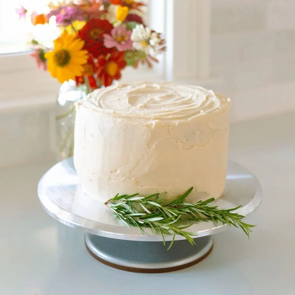
Sifted Bakehouse began with exceptional products, genuine hospitality, and a passion for handmade baking. What it lacked was a brand capable of expressing that same level of craftsmanship and creating a consistent experience across every customer touchpoint.
Rebel Brands partnered with the founders to build a complete brand system rooted in strategy, identity, packaging, photography, and storytelling. The result was a cohesive brand designed to earn trust, stand apart, and support long-term growth from the very first impression.
The Challenge
Sifted Bakehouse had already built a reputation for exceptional baked goods, handcrafted quality, and genuine hospitality. What it lacked was a brand that reflected the same level of care and created a consistent experience across every customer touchpoint.
As the business prepared for launch, every detail mattered. From the first impression on social media to the moment a customer walked away with a box of cookies, the brand needed to feel warm, memorable, and thoughtfully crafted. The challenge was not simply to design a logo, but to build a complete brand system that captured the heart of the business and gave it a strong foundation for long-term growth.
Strategic Insight
The strongest brands don't begin with products.
They begin with people.
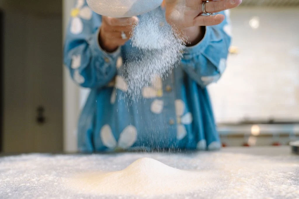
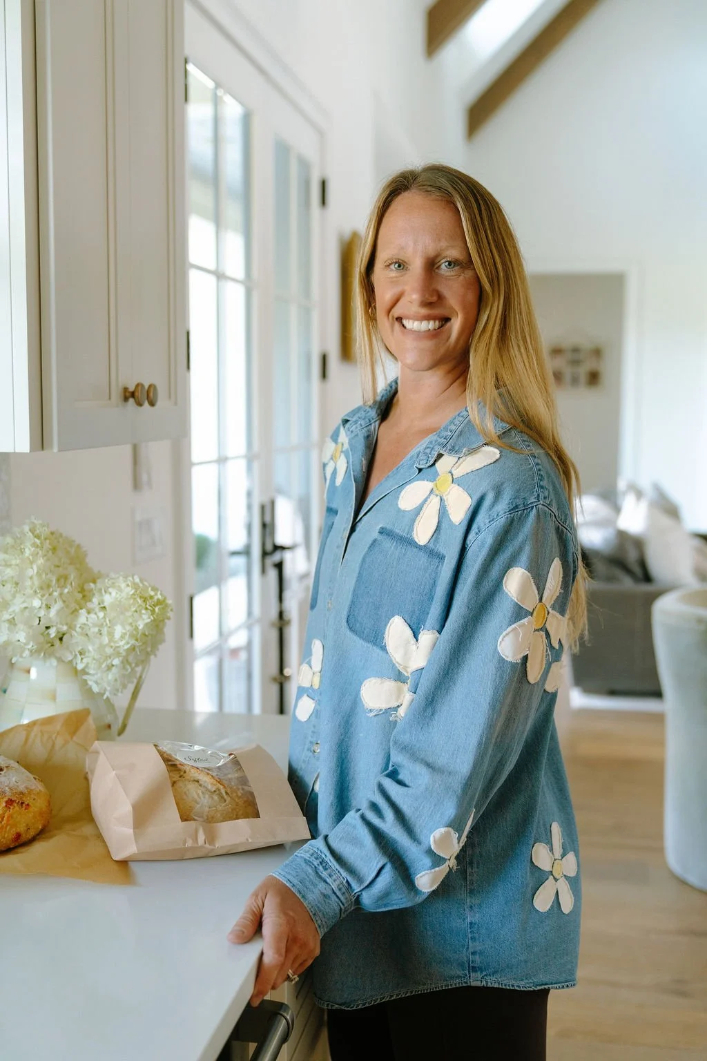
Sifted Bakehouse wasn't built around recipes. It was built around Rachel's story. Her love of baking began in the kitchen alongside her mother, using family recipes that had been passed down through generations. Rather than creating a brand around bread and pastries, we built an identity rooted in heritage, craftsmanship, and connection. Every element was designed to reflect the warmth of homemade baking and the simple joy of bringing people together around the table.
The Identity System
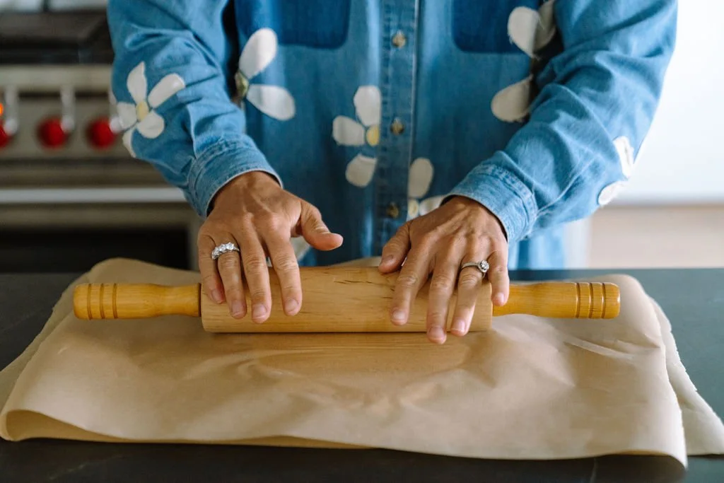
Every element of the identity was designed to express the values behind the brand, not simply create a recognizable logo. Together, the symbol, typography, color palette, textures, and supporting assets create a cohesive system that feels warm, handcrafted, and timeless across every customer touchpoint.
Primary Logo
The primary logo was designed to feel as timeless and handcrafted as the brand itself. Inspired by handwritten family recipes and complemented by a hand-drawn rosemary emblem, the identity reflects Sifted's commitment to craftsmanship, quality, and the simple joy of bringing people together.
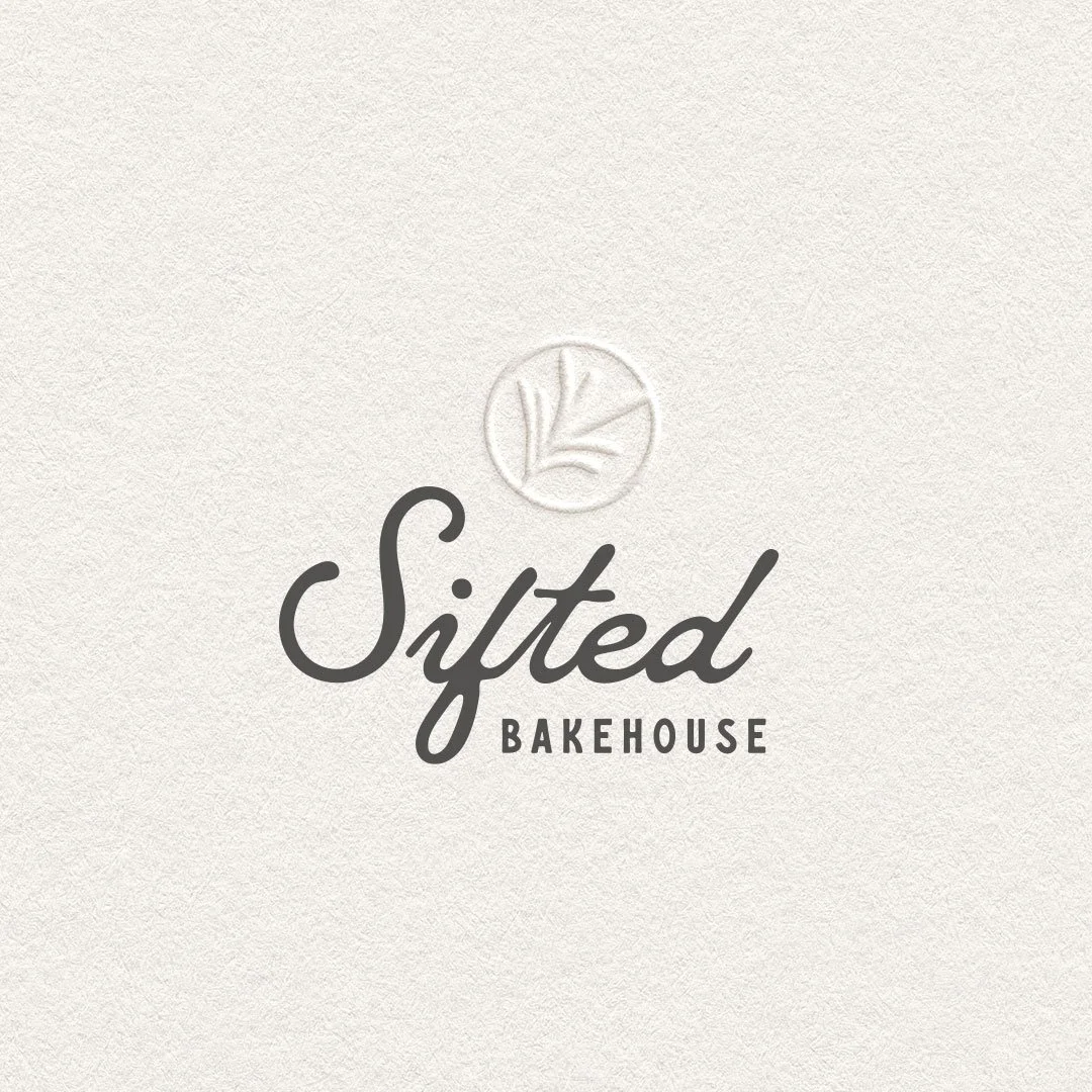
Ghost Emboss (Preferred)
The preferred expression of the Sifted identity, adding subtle texture and craftsmanship that reflects the handmade nature of the brand.
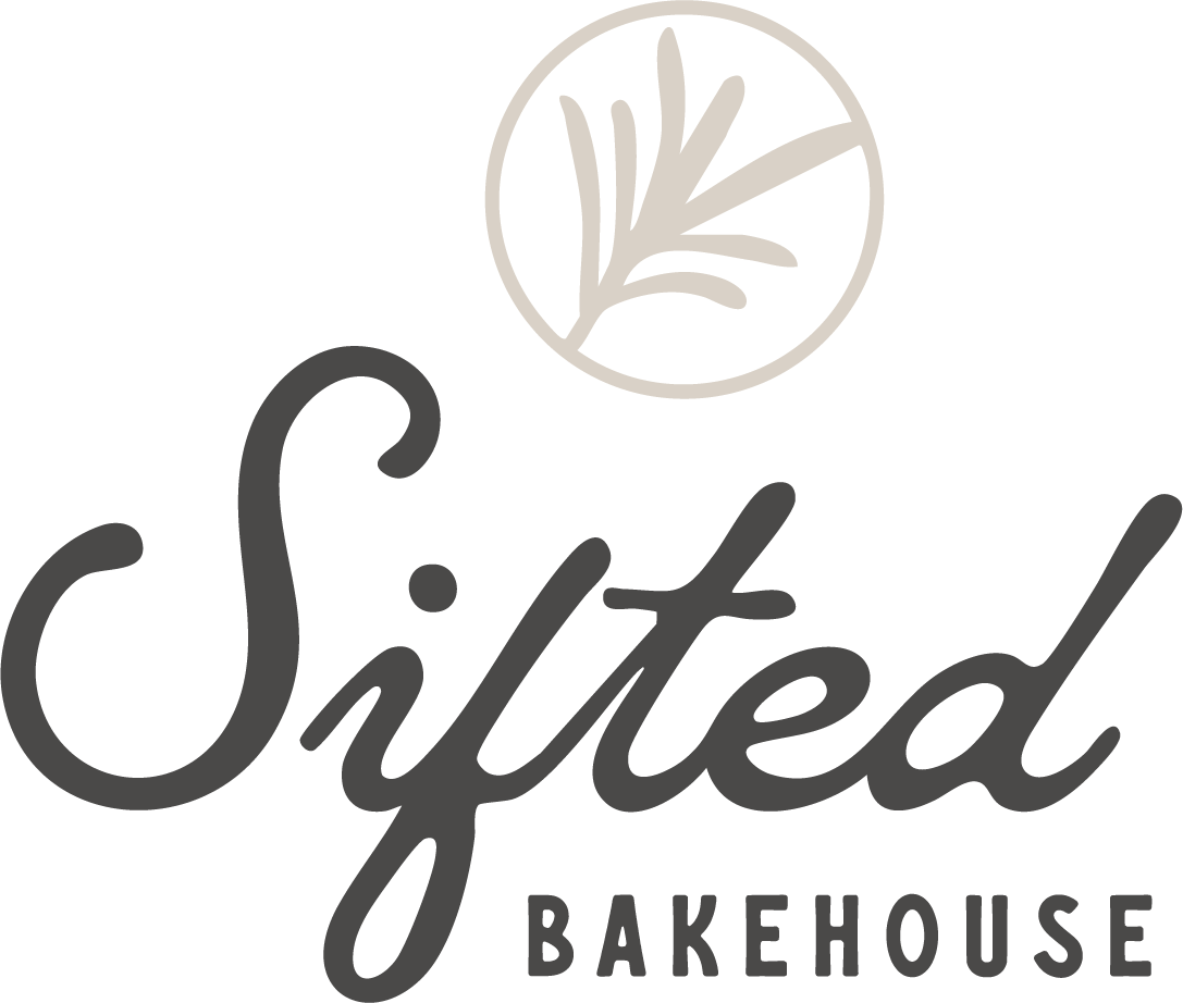
Standard Logo
A clean, versatile version optimized for everyday use across digital, print, packaging, and signage.

Ghost Emboss (Preferred)
The preferred expression of the Sifted identity, adding subtle texture and craftsmanship that reflects the handmade nature of the brand.
Rosemary Icon
More than a brand mark, the rosemary icon represents the heart of Sifted Bakehouse. Inspired by Rachel's family traditions and the memories created around the table, it symbolizes hospitality, nourishment, and connection. A timeless emblem woven throughout the identity, it serves as a reminder that the best moments are often shared over homemade food.

Standard Logo
A clean, versatile version optimized for everyday use across digital, print, packaging, and signage.
Color Palette
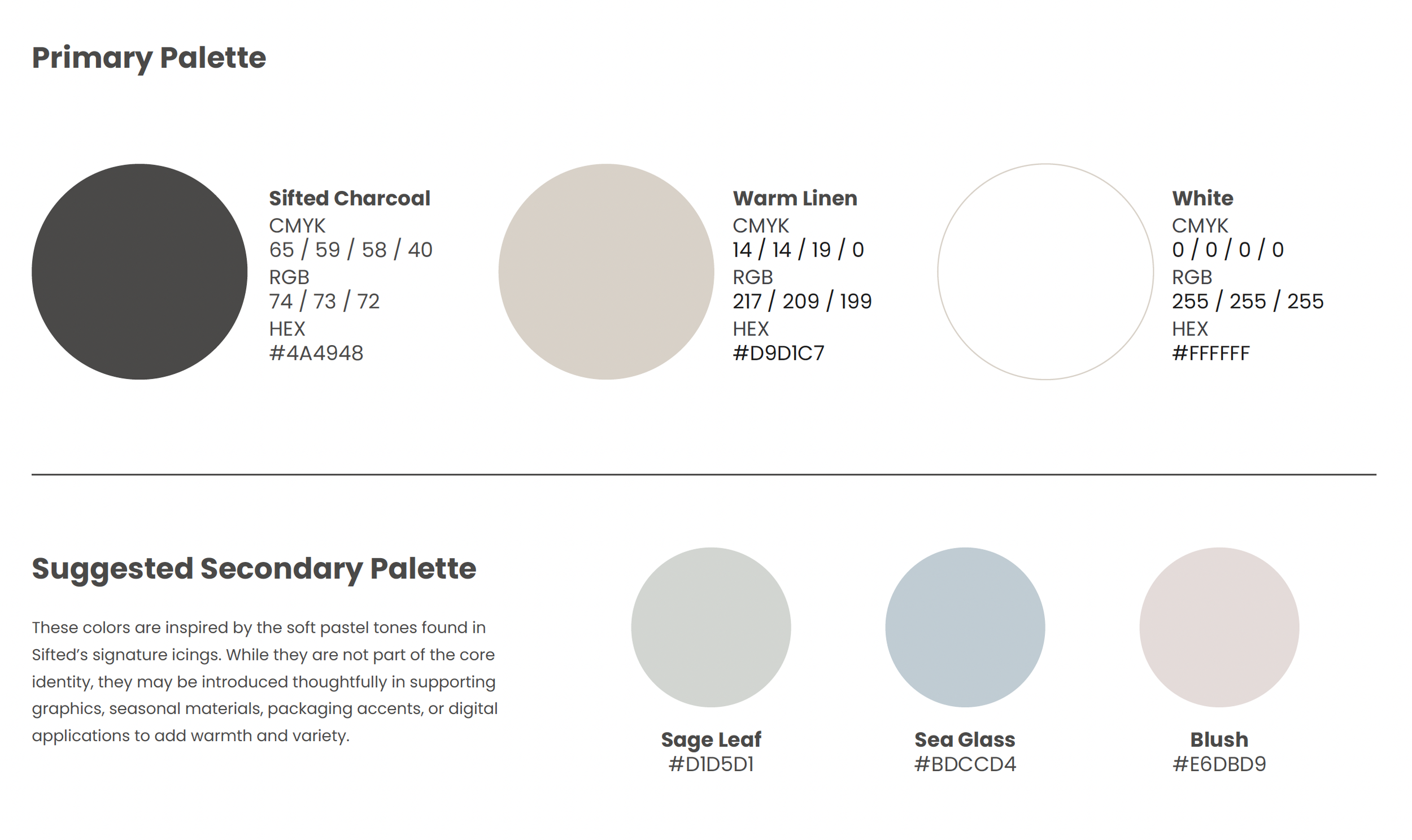
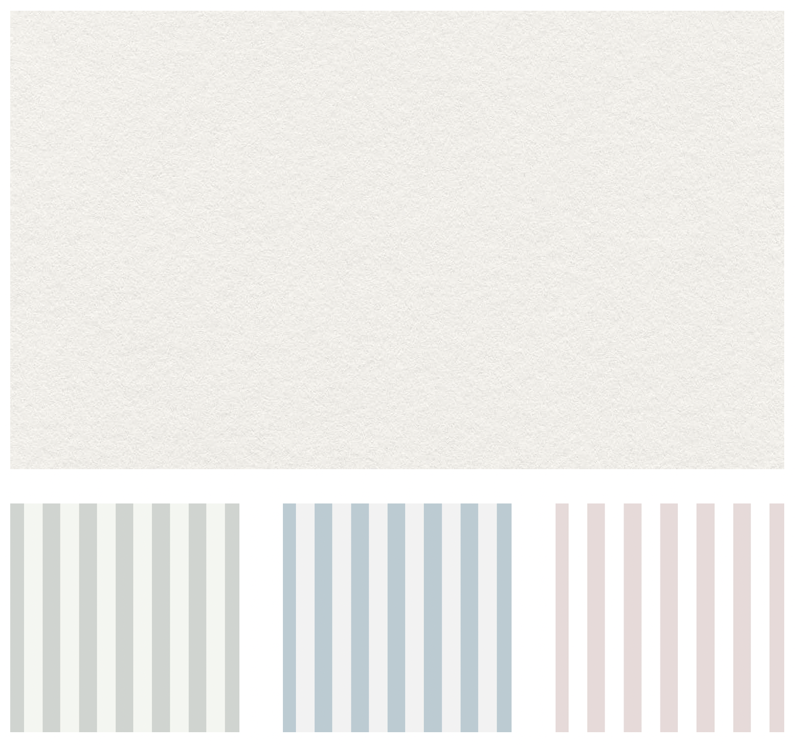
A restrained palette of warm neutrals creates a timeless foundation for the brand, allowing the natural colors of fresh ingredients and handcrafted baked goods to become the focal point. The result is an identity that feels warm, refined, and authentic.
Texture & Patterns
Texture plays an essential role in bringing the Sifted brand to life. Inspired by the warmth of handcrafted paper and traditional baking, the signature eggshell texture adds depth and authenticity across both print and digital applications. A collection of complementary striped patterns extends the identity with subtle color and visual interest, creating a flexible system that remains cohesive across packaging, seasonal promotions, and marketing materials.
Typography
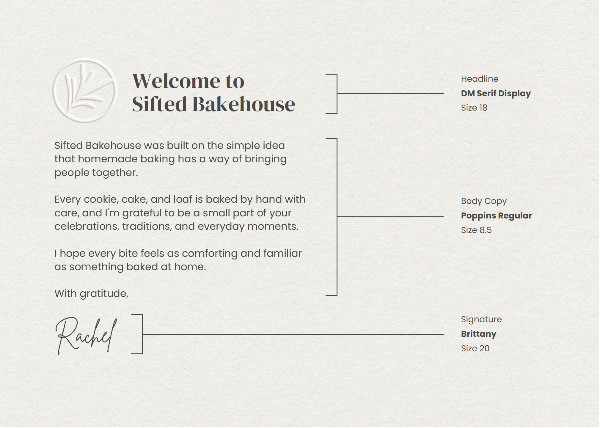
The typography system balances warmth, elegance, and clarity. Classic serif headlines paired with clean, modern body copy create a timeless hierarchy that feels both approachable and refined, while Rachel's handwritten signature adds a personal touch that reinforces the handcrafted nature of the brand.
Packaging
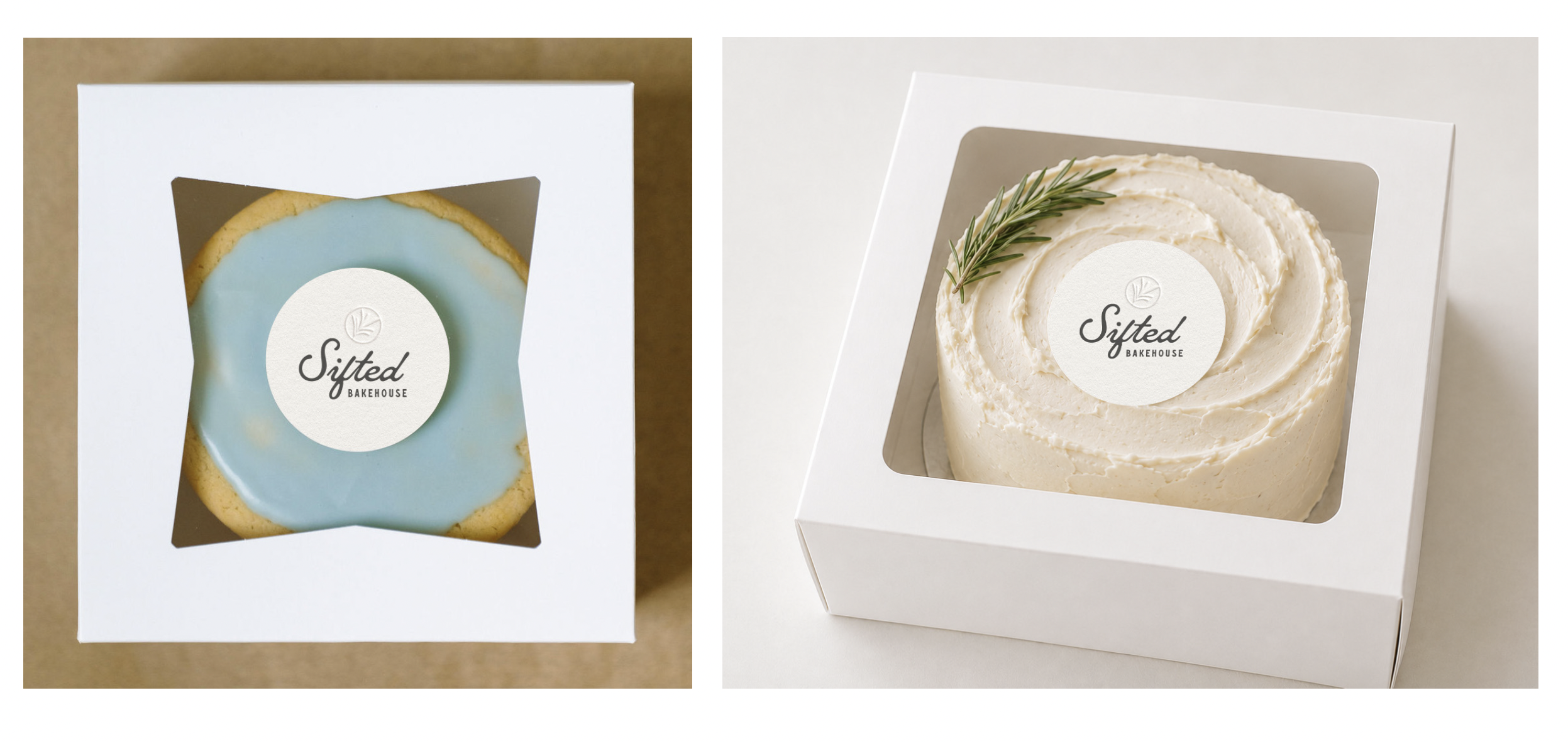
Designed to let the product speak for itself, Sifted's understated packaging highlights the natural beauty of each handcrafted bake. Clean window boxes and textured embossed details create an experience that feels warm, refined, and unmistakably Sifted.
Brand Photography
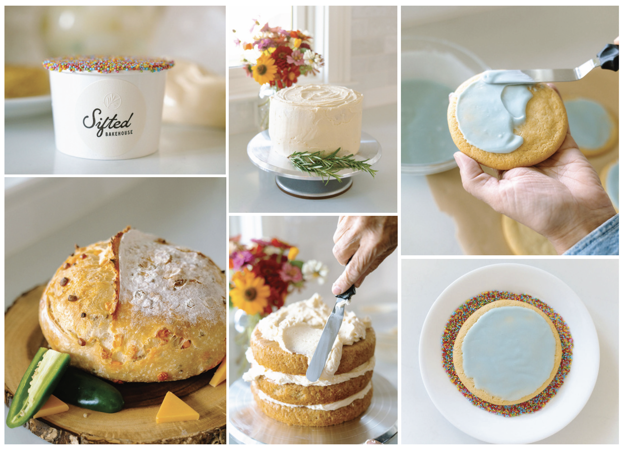
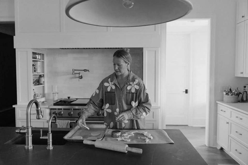
Photography was art directed as an integral part of the Sifted brand system, capturing the warmth, craftsmanship, and authenticity at the heart of the bakery. Beautifully photographed by Kara Warren Photography, the imagery brings Rachel's story to life through genuine moments, handcrafted details, and the timeless beauty of homemade baking.
Promotional Card
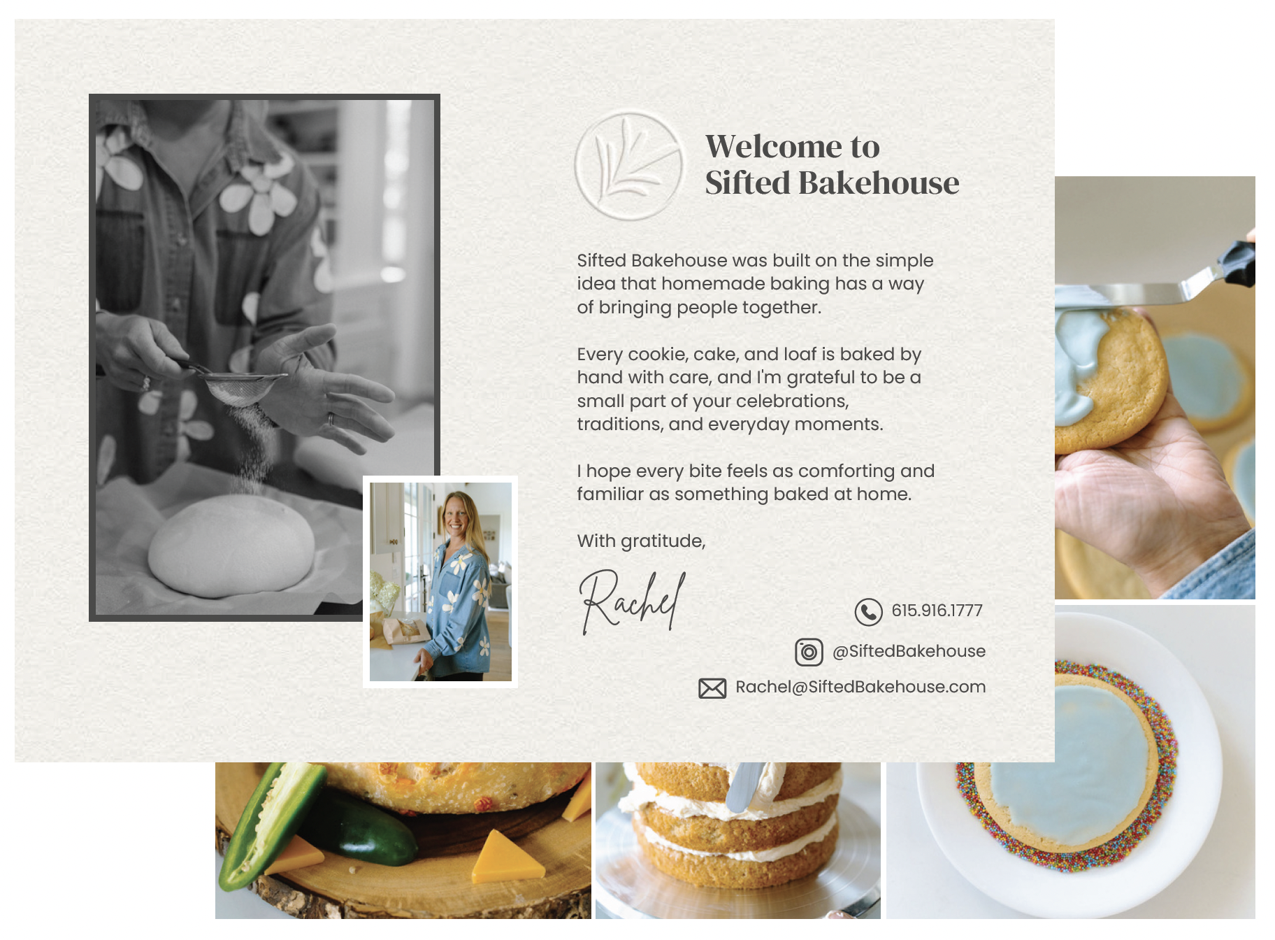
Designed as a thoughtful extension of the brand, the promotional card introduces Sifted in a warm, personal way while encouraging customers to share the experience with others. It's a simple touchpoint that strengthens connection, builds loyalty, and invites future visits.
Brand Extensions
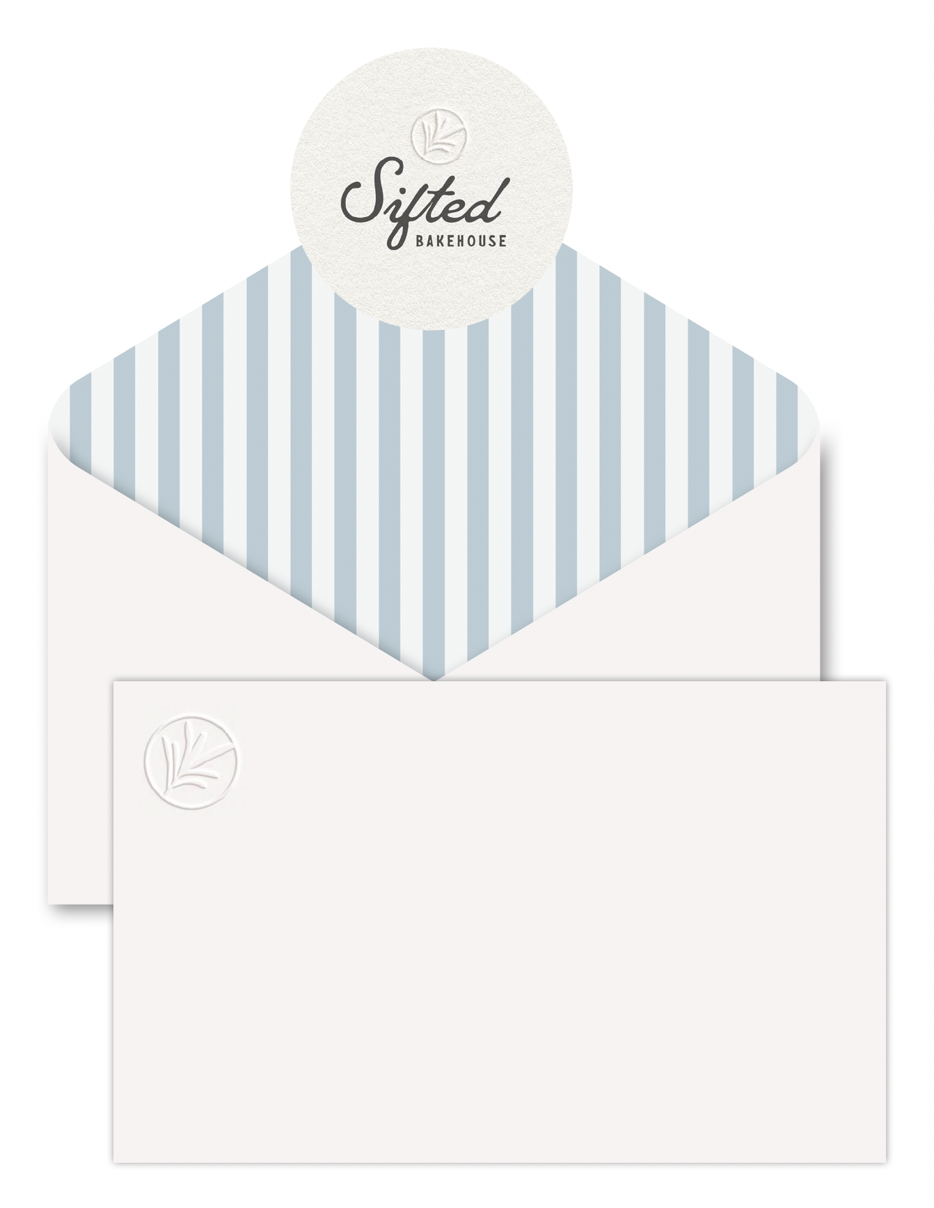
A successful brand is built through consistent experiences, not individual touchpoints. From packaging and stationery to promotional materials and custom details, every extension of the Sifted identity was thoughtfully designed to reflect the same warmth, craftsmanship, and timeless simplicity that define the bakery.
Branded Collateral
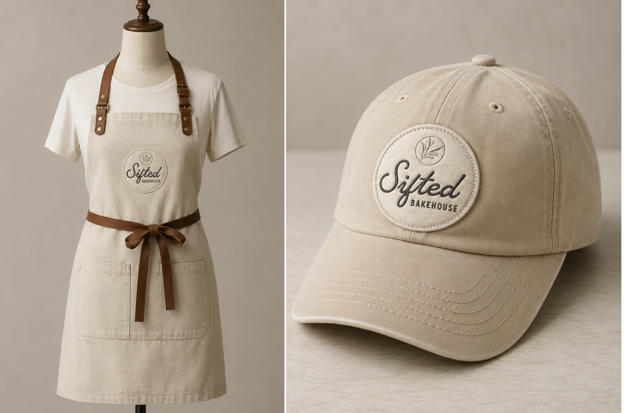
Every branded touchpoint was designed to extend the Sifted experience beyond the bakery. From apparel and merchandise to supporting collateral, each piece reinforces the same warmth, craftsmanship, and timeless simplicity found throughout the identity system, creating a cohesive and memorable brand experience.
Social Media
Designed to feel as authentic as the bakery itself, Sifted's social presence is built around beautiful photography, thoughtful storytelling, and a consistent visual identity. Minimal graphics and the signature rosemary icon keep the focus where it belongs: on the people, products, and moments that bring the brand to life.

Social Profile Icon
The rosemary icon serves as Sifted's signature social profile mark, creating a clean, recognizable presence that reinforces the brand across every platform.
Social Media Templates
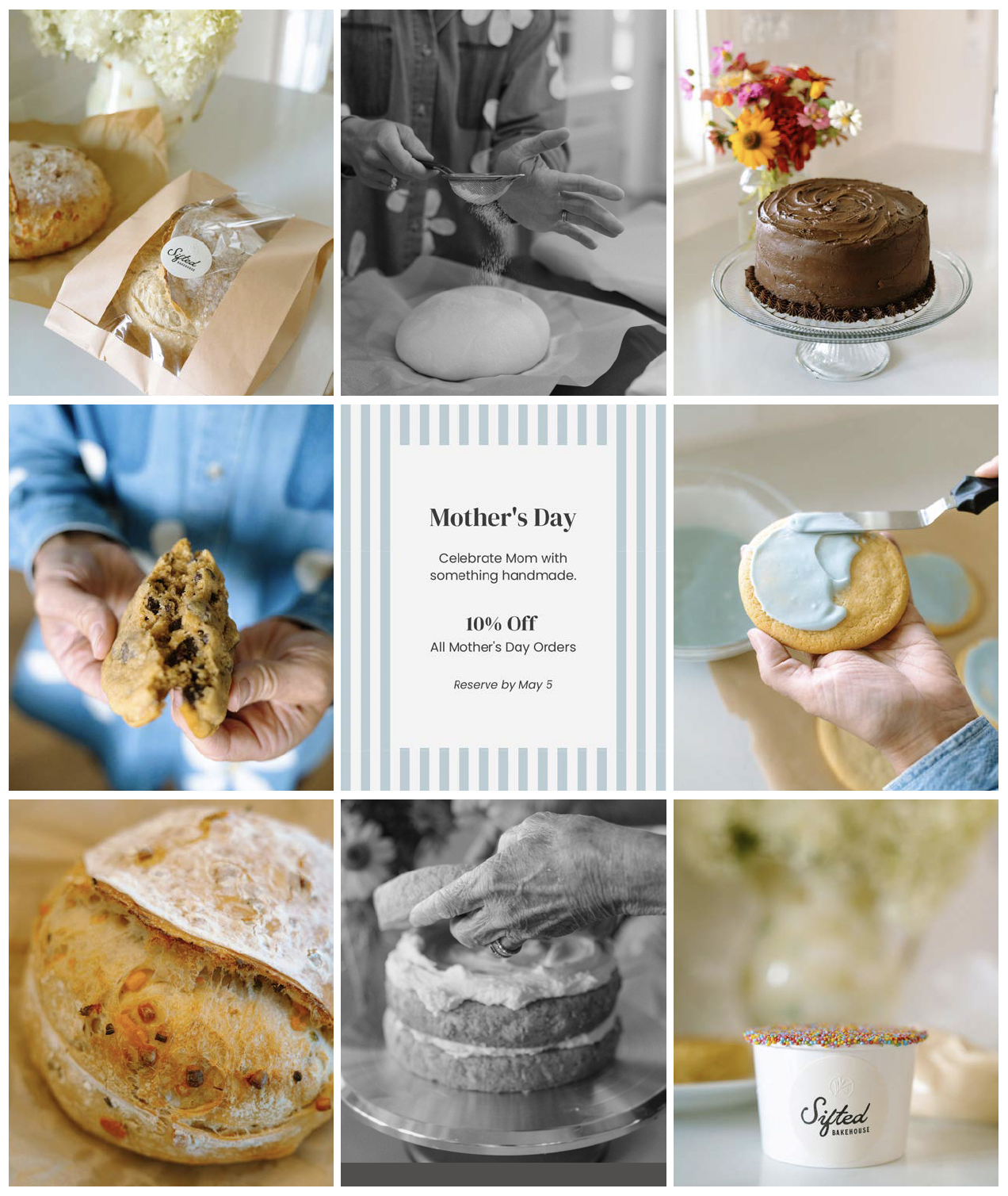
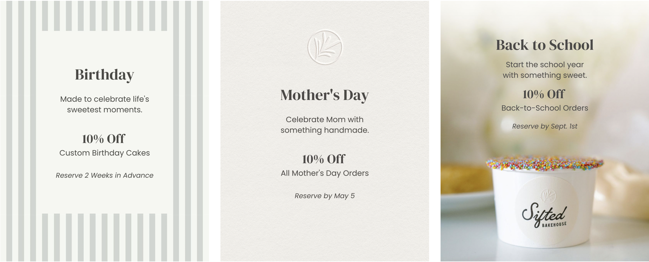
A library of customizable social media templates gives Sifted the flexibility to promote seasonal offerings, special events, and featured products while maintaining a cohesive brand presence. Built around the brand's signature colors, textures, and graphic elements, the system makes it easy to create content that feels both consistent and unmistakably Sifted.
The Result
A Brand Built for What's Next
Sifted Bakehouse now has a cohesive brand system that reflects the care, craftsmanship, and hospitality behind every bake. From packaging and photography to social media and promotional materials, every customer touchpoint works together to build recognition, strengthen trust, and create a memorable experience that feels unmistakably Sifted.
Ready for What's Next?
Whether you're launching a new business, entering a new market, or evolving beyond the brand that got you here, Rebel Brands creates strategic identity systems that help ambitious companies earn trust and grow with confidence.